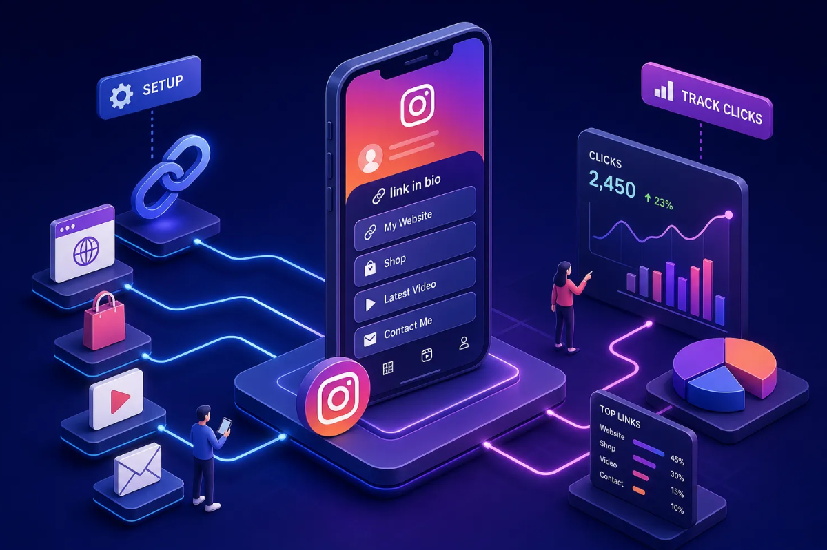




If you landed here, you want a real link in bio example you can study, pull apart, and copy for your own page, not just inspiration. Many link-in-bio pages are little more than a profile photo, a name, and a stack of buttons that visitors scroll past without clicking. They exist. They don't convert.
The ten link in bio examples below are organized by niche, with a breakdown of the logic behind each layout so you understand why it works, not just what it looks like. Every example in this article follows the same builder logic inside Binko, so you can see exactly how each layout works and recreate it yourself in under an hour.
What separates a converting link in bio example from a cluttered one
Before the examples, three principles appear in every high-performing bio page. Understanding them gives you a lens to evaluate each link in bio example rather than copying aesthetics blindly and wondering why your version doesn't perform the same way.
The three-tier layout that guides visitor behavior
The proven structure is simple: one high-intent primary CTA at the top, one or two supporting links in the middle, and trust-building content at the bottom. Visitors decide quickly, often within just a few seconds of landing, so the page has to hand them a clear first step the moment they arrive. Anything that competes equally with the primary action dilutes it.
CTA copy that earns the click, not just invites it
Specific, action-led labels consistently outperform vague ones. "Get the free workout plan" beats "Learn more." "Book a free call" beats "Contact me." The formula is verb plus outcome: tell the visitor exactly what happens when they tap. The strongest bio link examples in every niche use this approach without exception. Industry data consistently shows the top link captures 40 to 60 percent of all clicks on the page, which makes that first button far too valuable to waste on a generic label.
Why content hierarchy is the real conversion lever
Visitors don't read bio pages; they scan. When the visual weight of the page, button size, color contrast, font hierarchy, matches the priority of the action, click-through rates climb. A misaligned page gives equal visual weight to everything, which means attention splits across the whole page and the most important offer gets buried in the noise.
Creator and influencer link in bio examples
.png)
These examples cover niches where content output is high and audiences are loyal. The challenge is serving multiple destinations without overwhelming visitors the moment they arrive.
Fitness creator: single lead magnet up top, content below
A fitness influencer's page opens with a bold headline promising a free workout plan, followed by one oversized primary CTA button that captures the email and delivers the guide instantly. Below that sits a YouTube channel link, a coaching booking form, and a merch link. The free lead magnet at the top builds trust before asking for anything paid. A high-energy gradient background that mirrors the creator's brand colors signals immediately that this page belongs to them and not a generic template.
Lifestyle and beauty creator: product curation page as a shop
A beauty creator's page functions like a mini storefront. A media widget at the top shows featured product images, and affiliate links sit below, organized by category, skincare, makeup, and tools. A newsletter signup anchors the bottom. Image-forward layouts often outperform plain text button lists for product-based creators because visitors understand what they're clicking before they tap. The visual hierarchy keeps the page from feeling cluttered while still serving multiple destinations.
Podcast creator: listener conversion path done right
A podcaster's page funnels visitors based on where they are in the listener journey. The first link is labeled "New here? Start with this episode" and points to the most-downloaded episode. Below that sits a Spotify and Apple subscribe button, then an email list signup with a listener community hook. This sequenced structure reduces bounce because every visitor, whether brand new or already a regular, lands on something relevant to them immediately.
E-commerce and brand link in bio examples
For product-based businesses, the bio page has one job: get visitors one step closer to a purchase without losing them to navigation friction or a homepage that doesn't match what they clicked for.
Fashion brand: campaign-first, collection second
A fashion brand's page is built around the current seasonal campaign. A hero image widget shows the new collection, a "Shop the drop" primary CTA sits directly below it, and a secondary link points to best-sellers. A loyalty program signup lives further down for visitors who aren't ready to buy immediately. The key principle here is message match: the page headline mirrors the exact post or Story that drove the click, so visitors feel instantly confirmed that they're in the right place rather than questioning whether they clicked the wrong link.
Food and beverage brand: local roots, digital reach
A specialty food brand's page leads with a short video widget showing the product being made. Below that, a link to the online shop sits alongside a "Find us near you" store locator link and a newsletter opt-in offering a free recipe. The video widget at the top often does more storytelling than a single product photo can; it earns attention for products that need context to sell. The layered destination structure serves both online shoppers and local customers without splitting the page into two separate experiences.
Service business and professional link in bio examples
Service businesses have a different conversion goal: get the visitor to book, inquire, or trust enough to reach out. The layout shifts to deliver proof before the ask.
Photographer: portfolio preview plus booking path
A photographer's page leads with a gallery widget showing six recent images. Below it sits a "Book a session" primary CTA, followed by a client testimonials section and a link to the full portfolio site. Service buyers need proof before they act, and a gallery widget delivers that proof faster than any text description. For visual creatives, layout quality and image presentation are among the biggest differentiators from a generic link list.
Business coach: authority first, action second
A coach's page opens with a short credibility statement showing name, title, and one social proof metric ("500+ clients coached"). The primary CTA is a free discovery call booking link. Below that sits a podcast link, a free download, and a LinkedIn profile. Leading with a trust signal rather than a hard sell aligns with the longer decision cycle of coaching buyers. Coaching clients rarely convert on a cold click, credibility has to come first.
Local small business: frictionless contact and directions
A local salon or restaurant page puts "Book now" or "Reserve a table" first, then a click-to-call button, an embedded Google Maps link, and current hours. For local businesses, the bio page replaces a homepage entirely because it handles every action a nearby customer needs in one screen. There's no reason to make a walk-in customer navigate a full website to find a phone number.
How to build any of these layouts using Binko
Whether you're a photographer or a local restaurant owner, these layouts aren't theoretical, Binko gives you the specific widgets and design tools to replicate each one without any coding.
Choosing the right widgets for your niche layout
Binko's widget library covers the core building blocks every niche needs: media galleries, video embeds, music links, email capture forms, countdown timers, testimonial blocks, social icons, and more. The match is straightforward, gallery widget for photographers, music links widget for artists, email form widget for newsletter creators, video widget for food and product brands. Having the right widget ready removes the need to design anything from scratch, so you spend time on copy and strategy instead of layout mechanics.
Using gradient customization to match your brand identity
Brand-consistent visuals matter. Research on visual trust signals shows that pages matching a creator's established color palette and typography earn stronger first impressions than default templates. Binko's gradient background customization lets you match brand colors, set contrast so buttons pop visually, and create a cohesive experience that reinforces trust from the first scroll. The fitness creator's high-energy gradient and the fashion brand's seasonal campaign palette from earlier sections are both achievable directly in the builder.
Setting up your CTA and connecting analytics from day one
Configure your primary CTA button label using the verb-plus-outcome formula, order your links by conversion priority, and connect Binko's analytics dashboard before you publish. From day one you'll see which links get clicked, on which device, and from which traffic source. Many link-in-bio tools also support UTM parameter tagging for creators running Instagram or TikTok campaigns who want to trace conversions back to specific posts, check Binko's feature documentation to confirm current support.
Quick optimizations that lift clicks right away
Put your best offer first, always
The single biggest difference between a bio page that converts and one that doesn't is link order. Many visitors focus on the top of the page and don't scroll further. Position one belongs to your primary CTA, and no secondary link should take that spot, no matter how much you want to promote it. Industry data shows position one captures 40 to 60 percent of all clicks, while position five captures only 5 to 10 percent, a gap that makes link order one of the highest-leverage decisions on the entire page.
Match your bio text to your page headline
When someone clicks from a social post into your bio page and the headline doesn't echo the promise of that post, they bounce. Write the page headline after you know what content will be sending traffic, not before. The message-match principle applies to every niche: the click and the destination should feel like the same sentence.
Check your analytics weekly and move what isn't clicked
A link sitting at position three with zero clicks for two weeks is not pulling its weight. Binko's analytics show per-link click data so you can rotate underperformers out and test new CTAs without guessing. This habit separates bio pages that stay flat from ones that grow consistently over time.
Start with the link in bio example that fits, then build from there
A great link-in-bio page is not a list. It's a mini landing page built around one primary goal, with everything else supporting it. The link in bio examples across fitness, beauty, podcasting, fashion, food, photography, coaching, and local business all prove the same thing: clarity and hierarchy convert. The layout structure, the CTA copy, and the visual design are all levers you now know how to pull.
Choose a link in bio example above, open Binko, and replicate it widget by widget. You don't need a developer, a designer, or a complicated stack. The page you build today, optimized and connected to real analytics, is likely to outperform any generic link list you've been running, and the gap widens as you keep testing and refining. That's the compounding value of getting the structure right from the start.
Build Your High-Converting Bio Link Page Free
Quick start: Pick the link in bio example that matches your niche, sign up at Binko, and replicate the layout widget by widget. The whole process takes under an hour. Open your free account →
FAQ
What is a link in bio example?
A link in bio example is a reference page that shows how a high-converting bio link page is structured. It demonstrates layout, CTA placement, widget usage, and visual hierarchy for specific niches. Study these examples, then replicate the structure with Binko's link-in-bio builder.
How do I create a link in bio page?
Sign up at Binko (free, no credit card), choose a layout that matches your niche, add your primary CTA, supporting links, and trust-building content. The builder has 49+ widgets and gradient customization. Your page is live in minutes.
What's the best link in bio structure?
Use a three-tier layout: one high-intent primary CTA at the top (captures 40-60% of clicks), one or two supporting links in the middle, and trust-building content at the bottom. This structure works across fitness, beauty, podcasts, e-commerce, and local businesses.
What makes a link in bio page convert?
Three factors: link order (primary CTA first always), CTA copy (verb + outcome, like "Get the free workout plan"), and visual hierarchy (button size and contrast match priority). These levers are more important than aesthetics for driving clicks.
How many links should I put in my bio page?
Keep it between 3 and 7 links. More than 7 causes choice paralysis and visitors scroll past without clicking. Prioritize based on your current campaign goals, not what feels complete. Swap them out as campaigns change.
Can I track clicks on my link in bio page?
Yes. Binko's analytics dashboard shows per-link clicks, geographic data, device types, and referrer sources in real time. Add UTM parameters to destination URLs for GA4 attribution. Check your analytics weekly and rotate underperformers.
How do I choose the right link in bio example for my niche?
Match the example to your primary conversion goal: lead magnets for fitness creators, product galleries for e-commerce, booking CTAs for service businesses, music widgets for artists. Binko's widget library covers every niche.
Can I customize the look of my link in bio page?
Yes. Binko offers gradient background customization, logo embedding, font control, button styling, and 49+ widget types. Match your brand colors, set contrast so buttons pop, and create a cohesive experience that reinforces trust.
What's the average click-through rate for link in bio pages?
The average bio link CTR is 1-3% of profile visits. Optimized pages with strong CTAs, fast load times, and clear hierarchy hit 4% or higher. The difference is structure and tracking, not luck.
Can I use my own branded domain for my link in bio?
Yes. Binko supports custom branded domains on the free plan. Use go.yourbrand.com for your bio link instead of a generic shortener domain. Branded links outperform generic ones by 34-39% in email and 28-32% on social media.